Cracking the Code of Designing
Effective Information Visualizations
If you think improving your information visualization skills means becoming a design expert—think again.
In a 2009 interview with McKinsey, Google’s Chief Economist, Dr. Hal Varian, reflected on the then-emerging role of data storytelling, stating, “the ability to take data, to be able to understand it, to process it, to extract value from it, to visualize it, to communicate it—that’s going to be a hugely important skill in the next decade.”
Dr. Varian couldn’t have been more spot on. Indeed, the ever-evolving and expanding use of data in business has brought forth new skill requirements for analytics professionals. Today, analyzing information is only half the battle: while data offers a ton of potential value to a business, none can be actualized until that information is translated into insights.
As humans, we obtain more information through vision than all our other senses. That’s why visualizations, as a component of data storytelling, are critical to communicating these insights.
As the founder of Data Story Academy™, I’ve worked with many brilliant professionals with advanced degrees in statistics, math, economics, and engineering—many of whom struggle with visualizing information and communicating insights effectively.
However, throughout my career, I’ve also seen a direct, causal relationship between data storytelling skills and success in the analytics profession. Positioned as sources of truth and insight, exceptional data storytellers are more likely to find themselves at the center of the business decision-making process, thus, increasing their impact and earning potential.
Transform the way you visualize and present information in this three-part, online data storytelling course
Data storytelling offers a structured approach for communicating insights through a combination of data, visualization, and narrative techniques. In this three-part, online course, you’ll learn how to:

Step 1
Identify, organize and design the most important stories in your data that inspire quick insight and support executive decision-making.

Step 2
Effectively enhance your charts and graphs with color, white space, and other design elements to create powerful information visualizations.

Step 3
Present data in a way that communicates clear, compelling and memorable stories to executives, management and other business stakeholders.
This course is geared toward business analysts, emerging analytics leaders, and anyone else looking to level-up their skills in visualizing and telling stories with information.

Deb Hawkins | Senior Analyst, ECommerce Data & Analytics
Hi Zack, I just watched your courses and have to say they were fantastic . . . because how often do you actually find courses worth watching?! It's very rare. The title of the email I sent to my boss and co-workers was “It’s like finding a unicorn!” Thank you for the valuable insights!
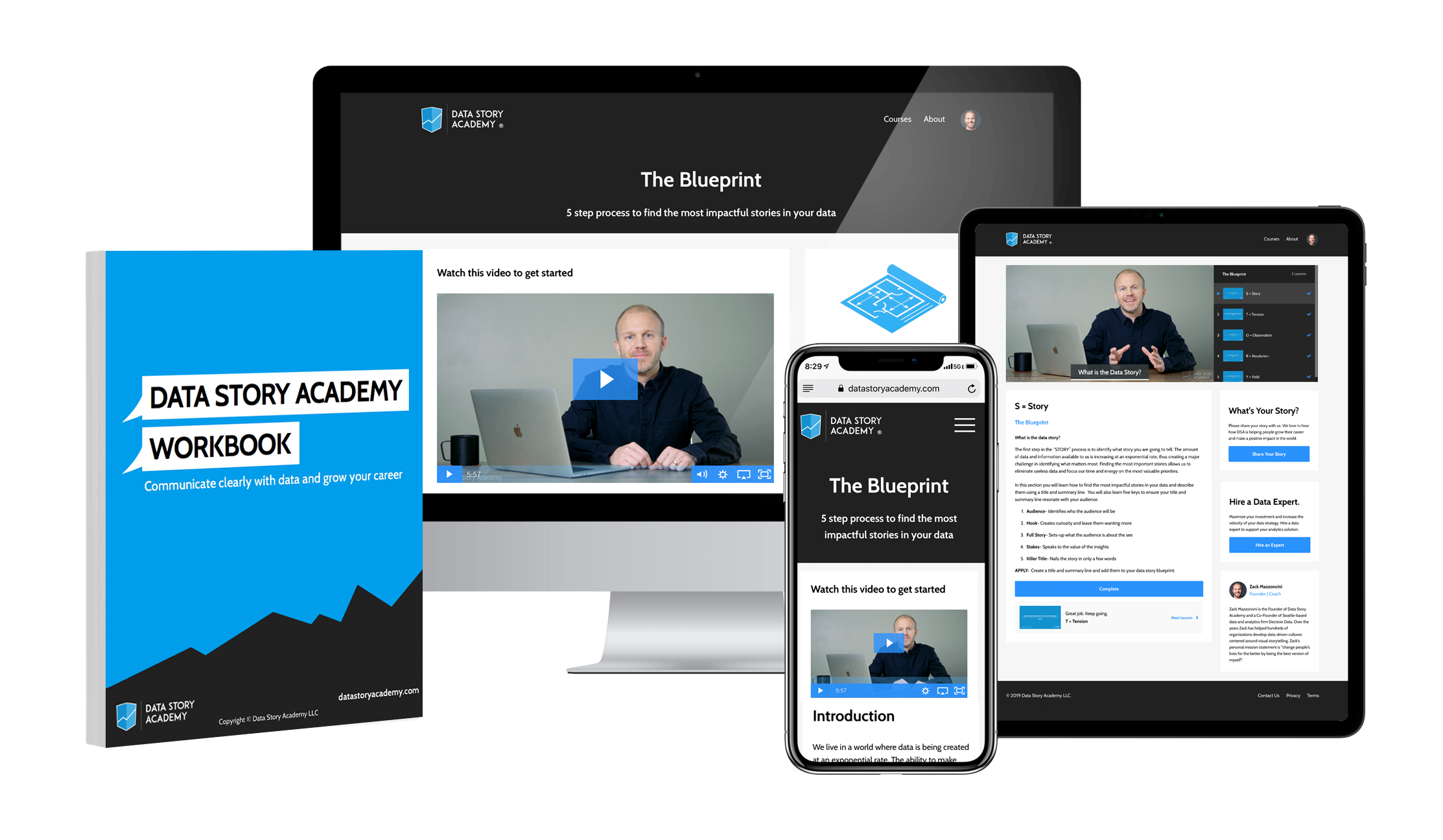
What's included in the course?
- Instant and unlimited access to 22 video lessons
- Access to methodologies used by major brands for delivering high-impact data stories and dashboards
- A printable place-mat reference for designing effective information visualizations
- A 60-page workbook to guide you through the course
- 40+ question assessment
- Certificate of Completion
What Defines a “Good” Visualization?
When it comes to visualizing information, success isn’t measured by how beautiful your graphs and charts look. Rather, a successful data visualization is measured by its ability to highlight patterns and key insights within vast amounts of data.
Three questions to ask yourself when assessing your information visualization skills.
⑴ Do your visualizations support the story you want to tell?
Think of the last time you created a dashboard: did you jump right into designing your charts and graphs without ever stopping to think about the bigger picture?
In the Data Story Academy foundational courses you’ll learn that questions serve as the framework for an effective data story. These are critical to uncovering insights that your audience cares the most about, and designing information visualizations that inspire them to action.
⑵ Are your visualizations simple and easy to understand?
The amount of data available to us can make it hard to identify what matters most to your audience. Furthermore, as analytics experts, our familiarity with data can also mean that we tend to make our visualizations overly complicated, noisy or downright overwhelming to an executive-level audience.
Designing effective information visualizations requires you to strike a balance between complexity and clarity. This pertains to the amount of information you show at a time, as well as how you use color, fonts, labels, formatting, and other design elements.
As part of Data Story Academy’s courses, you’ll learn how to select and design charts, graphs, and dashboards that enable your audience to see the insight within the data as quickly as possible.
⑶ Do your data visualizations flow intuitively?
Many analysts don’t stop to think about layouts when designing dashboards. Instead, they take a set of recommendations and start building visuals, placing them haphazardly throughout their canvas. This can create confusion within your audience, as the information and insights don’t follow an intuitive pattern or flow.
Through Data Story Academy, you’ll learn how to layout your dashboard in a thoughtful way to ensure your audience can quickly and clearly understand the messages you’re trying to communicate.

About the Author
Zack Mazzoncini is the Founder of Data Story Academy, Co-Founder of Decisive Data, a Seattle-based data and analytics firm and Co-Creator of the Art + Data initiative. Zack is an expert in analytics, rhetoric, communication and considered one of the most entertaining and informative speakers in the industry. Zack has helped hundreds of organizations—including Nike, Amazon, Starbucks, Google, TD Ameritrade, and Kaiser Permanente—develop data-driven cultures centered around data storytelling.
BECOME A DATA STORYTELLING EXPERT
The 20 Data Storytelling Keys for Success is your guide to understanding and developing data storytelling skills of your own. These keys are often what separates a clear message or data story from a confusing one.
If your visualizations are confusing,
no one will pay attention.
Buy Data Story Academy for $697 to begin your journey toward becoming a better data storyteller.
Buy The Courses