
Build Dashboards People Actually Use
Read Time – 5 minutes
Dashboards are supposed to make decisions easier.
But most dashboards feel more like puzzles than tools.
Too much clutter.
No clear point.
And users left wondering, “What am I supposed to do with this?”
Let’s fix that.
Here’s a 5-step dashboard design process that puts your audience first so your data drives clarity, not confusion.
Step 1: Hook
Start with a powerful title and summary line.
Skip the generic “Q2 Performance Dashboard.” Instead, lead with the core story you’re telling. Hook the audience with a focused title and summary line that set the stage.
Sales Hook:
-
Title: Accelerating Enterprise Sales Growth
-
Summary: Driving revenue through strategic pipeline growth, account targeting, and deal execution.
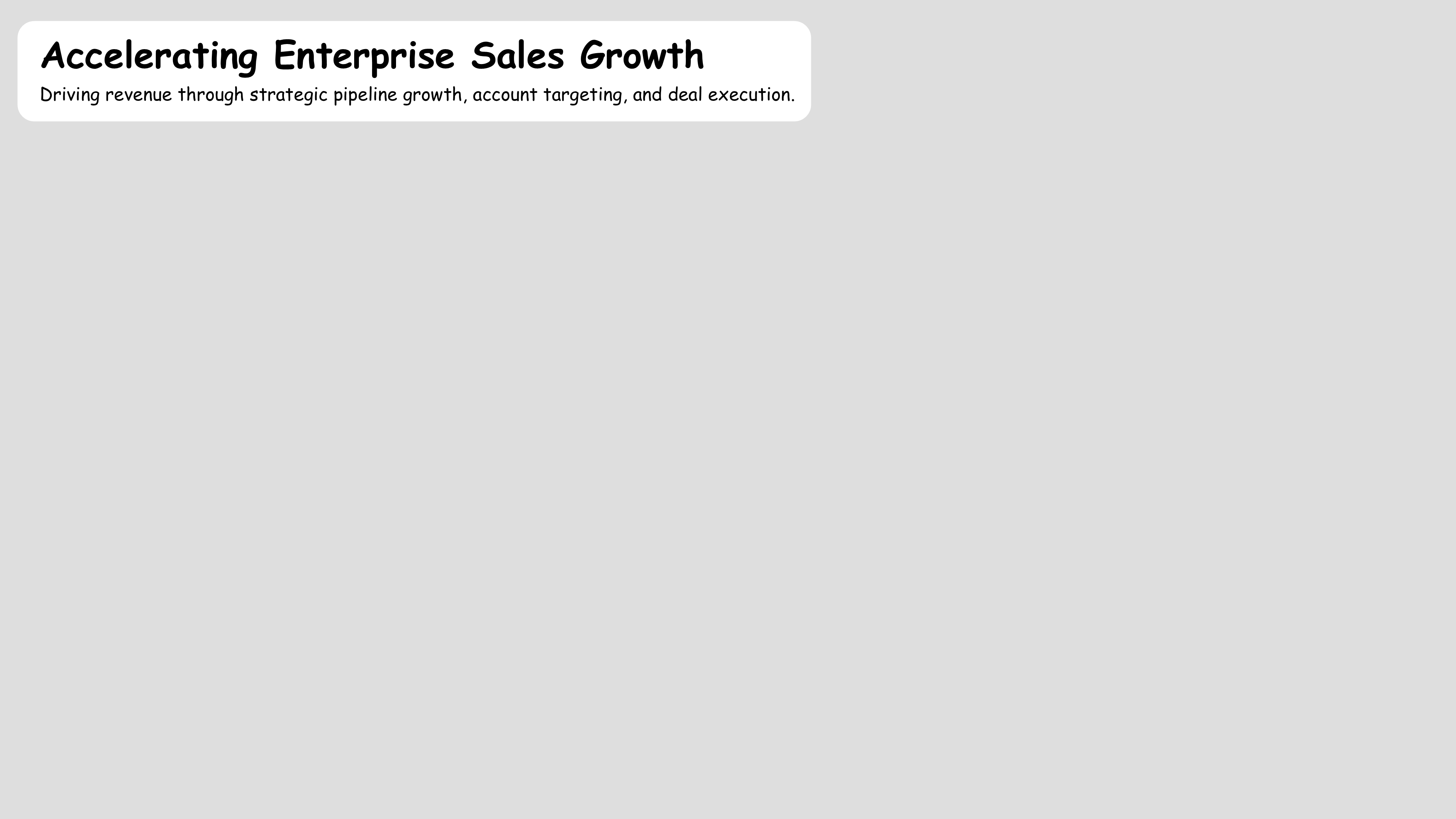
This title tells your audience exactly what they’re looking at and why it matters.
Step 2: Questions
Answer the top 2–3 questions your audience cares about most.
Not what you can show.
What they want to know.
This transforms your dashboard from a data dump into an outcome focused tool.
Sales Questions:
-
How is pipeline building across key industry segments?
-
Which opportunities show highest win potential?
-
Are our quarterly deal cycles improving over time?
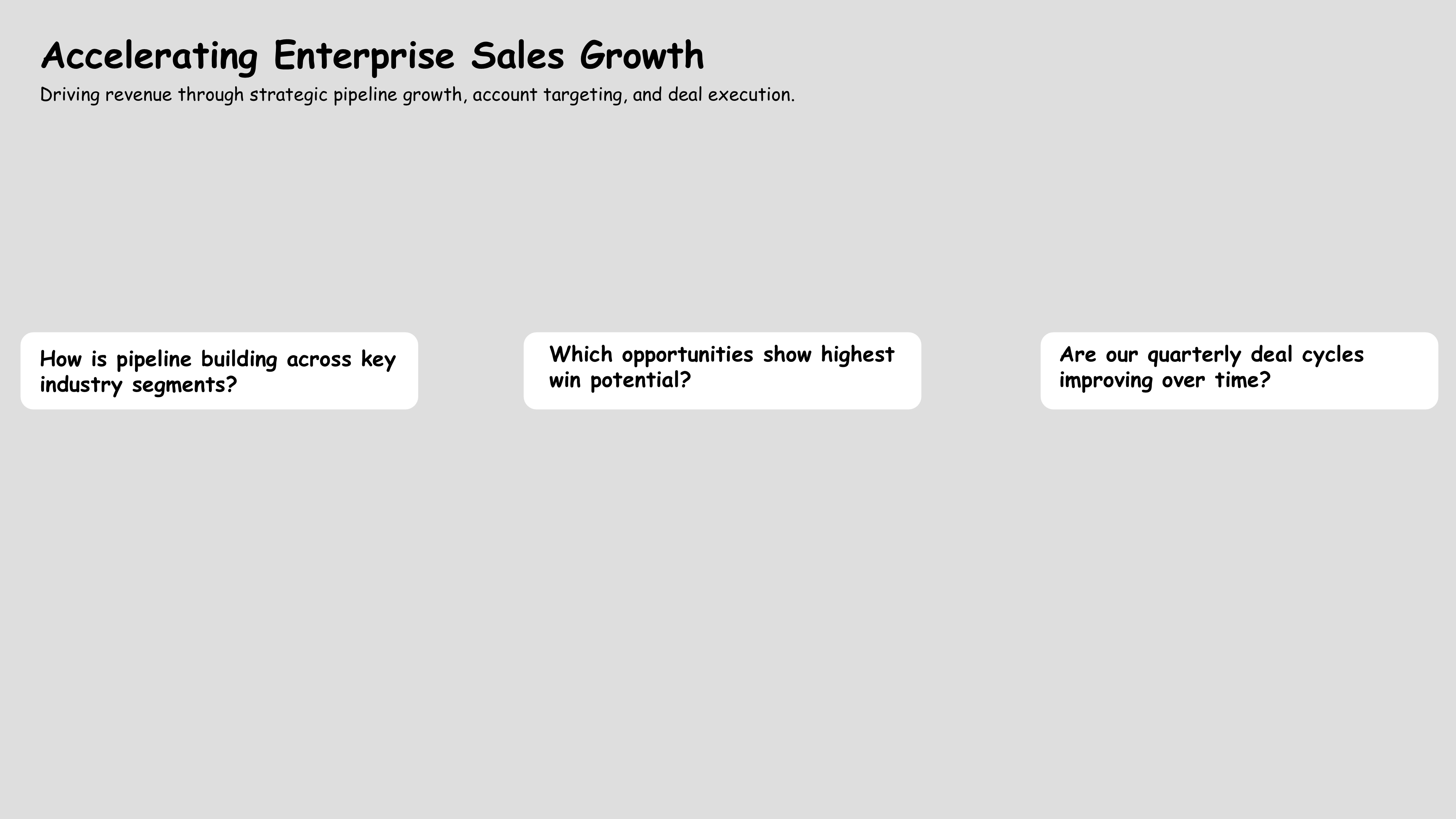
These questions now drive every visual decision that follows.
Step 3: Visuals
Choose visuals that deliver instant insight.
Avoid complexity for complexity’s sake.
A simple bar or line is often all you need.
Keep it scannable. Keep it clear.
Sales Example:
-
Top row: Big number KPIs for pipeline, conversion, win rate, and retention
-
Bottom row:
-
Bar chart: Pipeline by segment
-
Scatterplot: Opportunity win potential
-
Area chart: Quarterly deal cycle trends
-
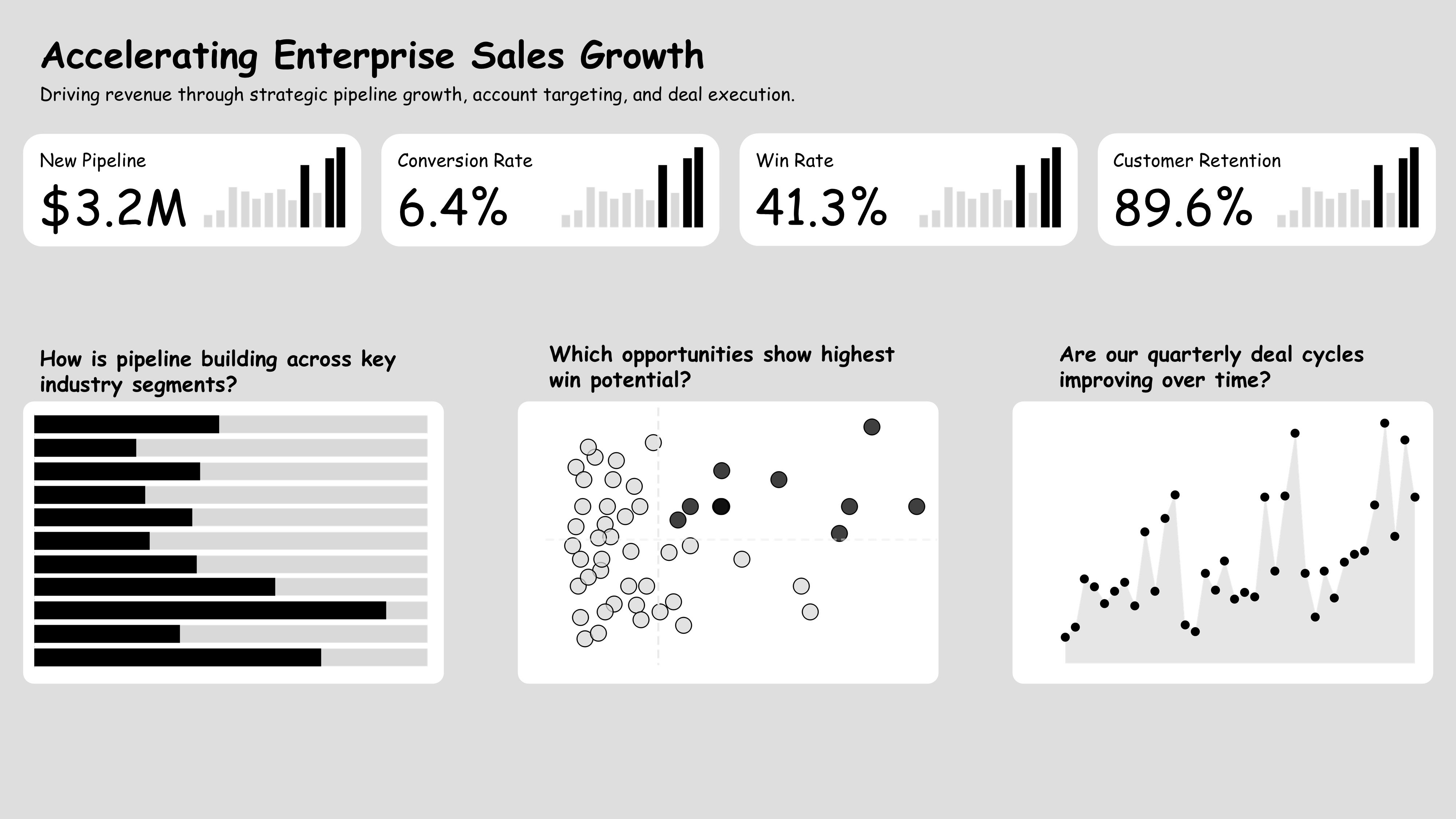
Each visual matches a key business question and is easy to interpret at a glance.
Step 4: Controls
Give users the power to explore but don’t overload them.
Use filters to let them adjust what they see.
Include footers and buttons for deeper dives or next steps.
But always keep the experience focused.
Sales Example:
-
Date and segment dropdowns
-
Download and share buttons
-
Footer with update timestamp, source, and support contact
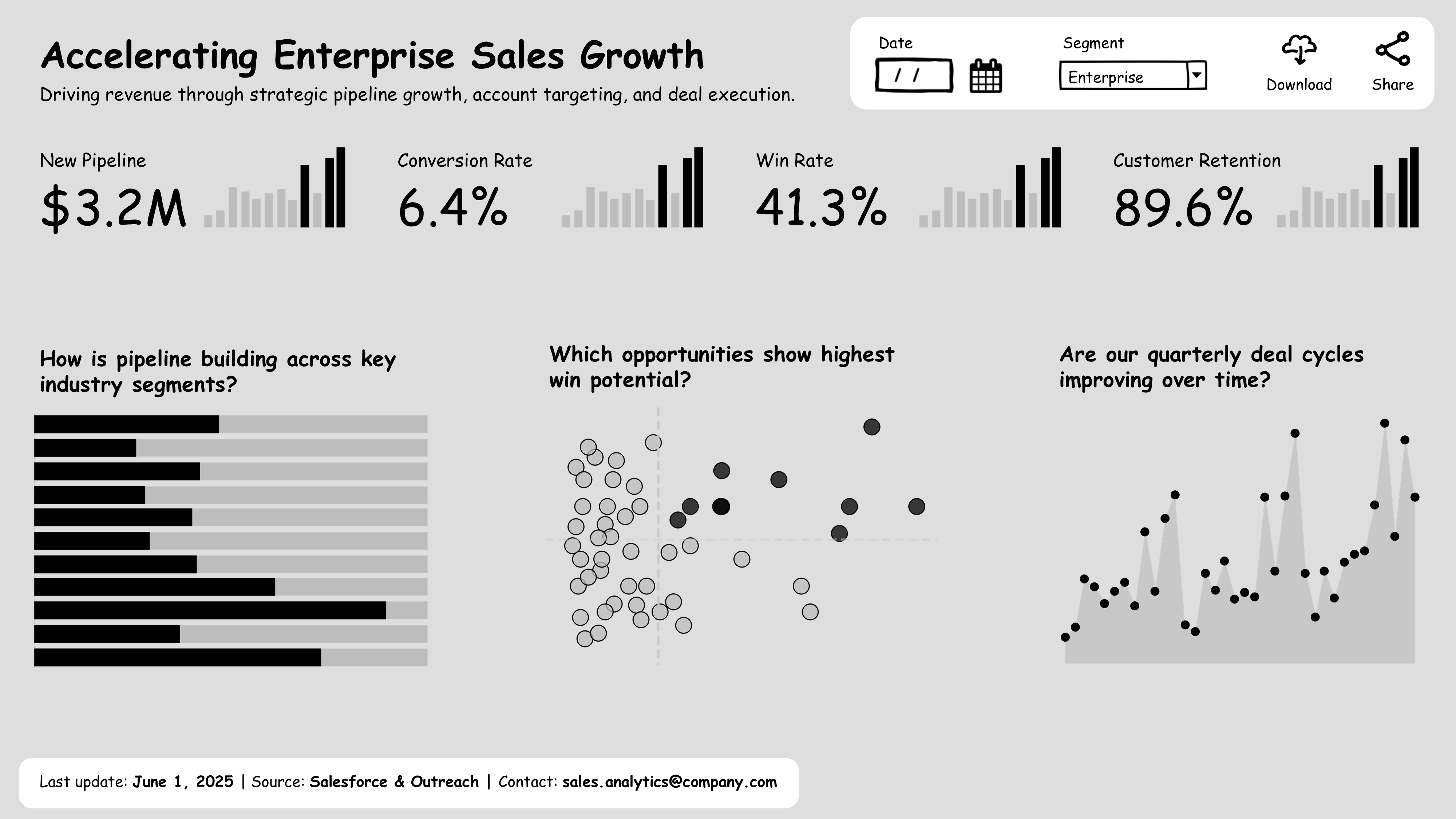
These elements provide flexibility without distracting from the main message.
Step 5: YOU
Bring the story to life with narrative.
Add a short video (30-60 seconds) and phrases that explains what they’re seeing and why it matters.
Frame it in plain language. Make it personal.
Sales Example Narratives:
-
Pipeline is growing in key enterprise segments.
-
Deals with high activity and product fit close fastest.
-
Shorter cycles and stronger close rates are driving growth.
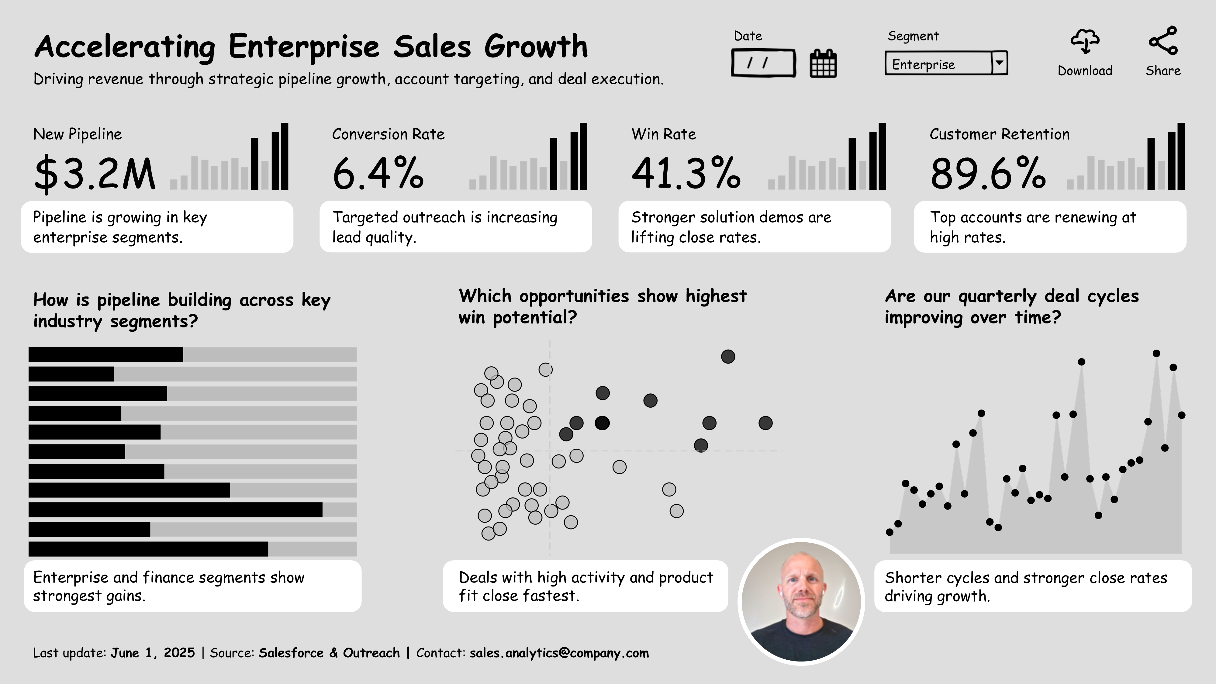
These short, confident insights move the audience from observation to understanding.
Final Thought
A dashboard isn’t complete when the charts are built.
It’s complete when your audience gets it, fast.
Use these 5 steps:
✔ Hook with a clear title
✔ Start with key questions
✔ Design for fast insight
✔ Add smart controls & context
✔ Tell the story only you can tell
That’s how you make dashboards that matter.