
Read Time – 5 minutes
We’ve all seen dashboards, slides, and spreadsheets that look like a confetti explosion. Multiple colors fighting for attention, but none telling us what we need to know.
It may seem harmless, but poor color choices can do real damage.
They confuse your audience.
They bury your message.
They create the wrong emotional tone.
And worst of all?
They make your data easy to ignore.
Let’s fix that.
Why Color Matters More Than You Think
Color isn’t just about decoration, it’s about communication.
We don’t just see color.
We feel it.
The right color can:
✔ Highlight what matters
✔ Reinforce your message
✔ Trigger the right emotional response
The wrong color can do the opposite:
✘ Distract from the insight
✘ Mislead your audience
✘ Create urgency when none exists or worse, make serious problems seem unimportant
Example 1: Same Chart, Two Different Feelings
Let’s say you’re showing revenue performance that’s come in under target.
🟠 In the first chart, the months that missed target are shown in orange.
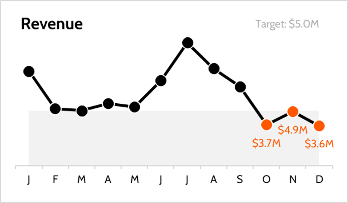
The message?
“This is urgent. Something’s wrong.”
It triggers stress, concern, and immediate attention.
🔵 In the second chart, the exact same data is shown in blue.
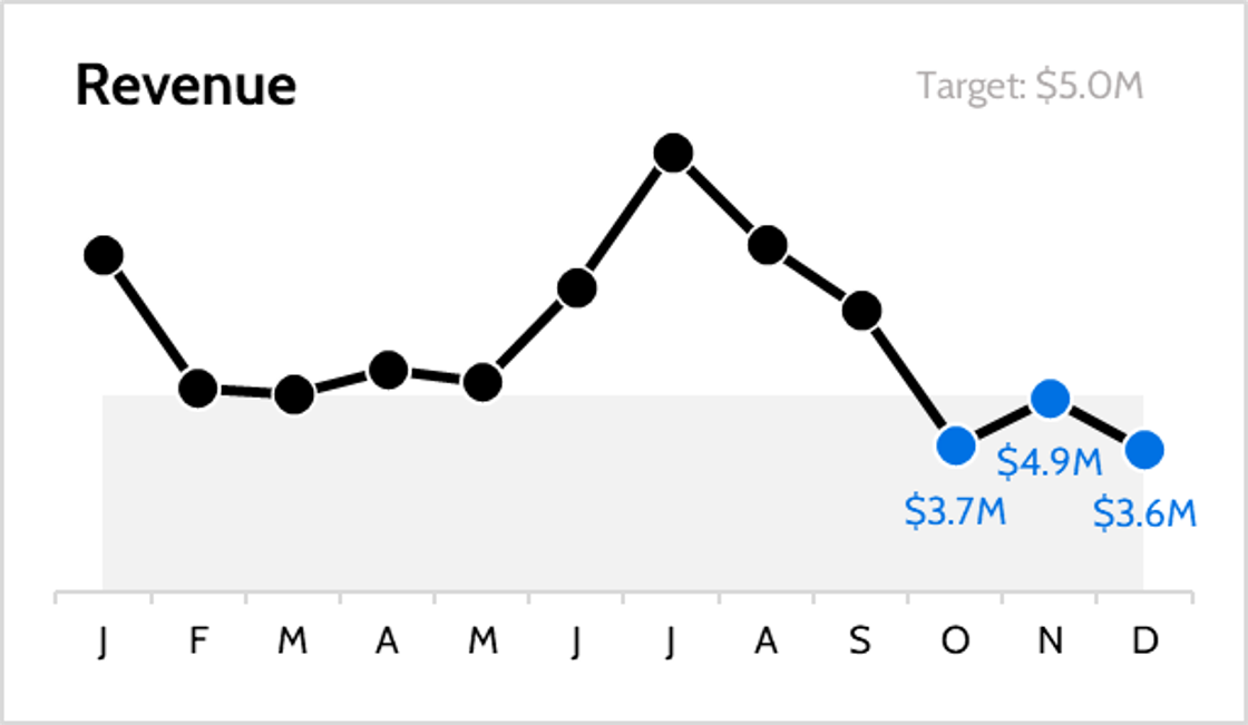
The message?
“This is manageable. Let’s take a calm look.”
It encourages a more thoughtful, measured reaction.
Same data. Different color. Totally different feeling.
Color creates context.
Before your audience reads a word, color tells them how to feel.
Example 2: Color Should Focus Attention, Not Distract It
Now let’s look at a scatter plot with multiple data points.
Before:
Every category is a different color—purple, green, orange, teal. It’s a rainbow of distraction.
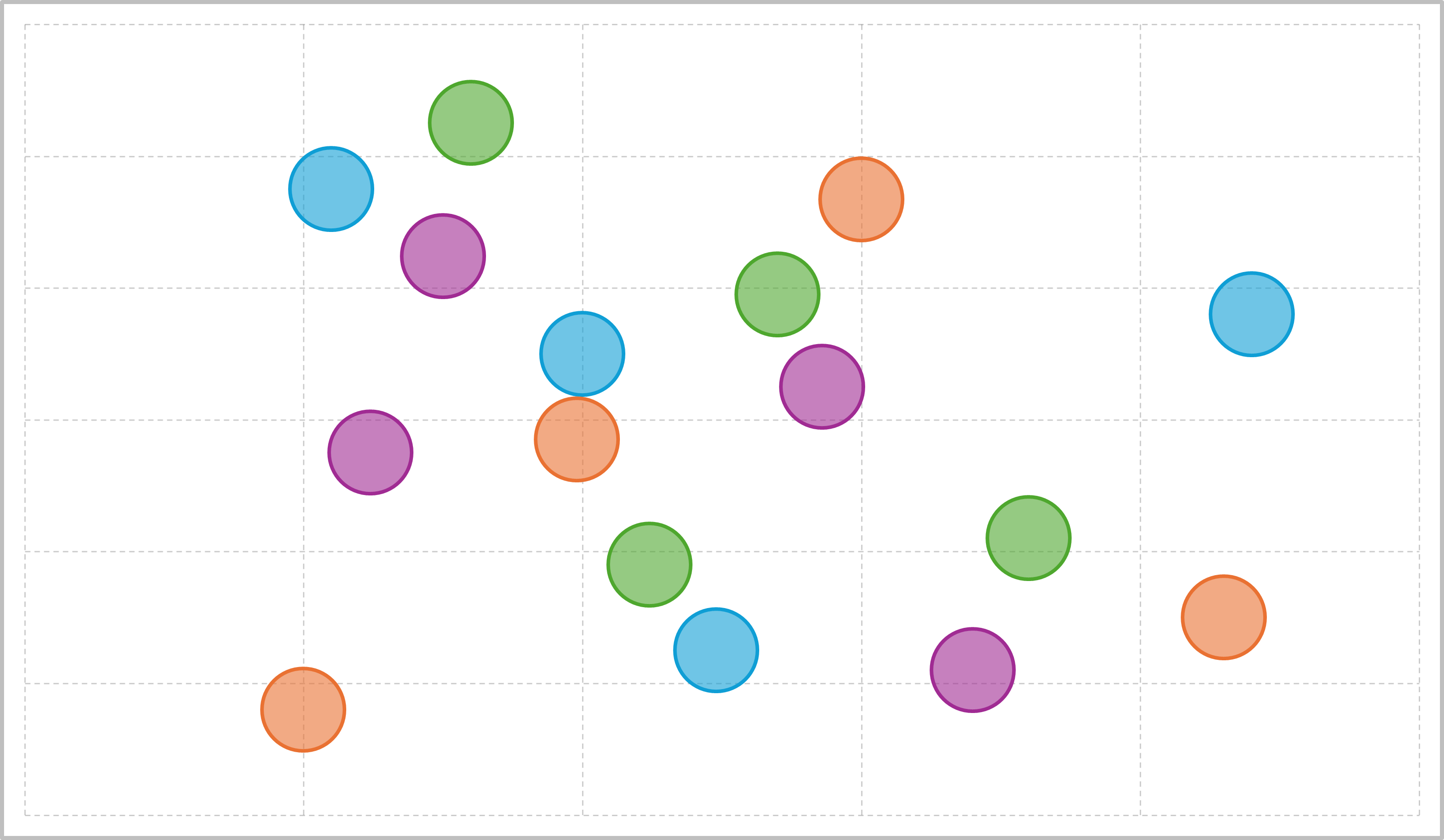
✘ Everything pops
✘ Nothing stands out
✘ Your audience has to work to find meaning
After:
You gray out the irrelevant points and use one bold color to highlight the 3 key customers you want to talk about.
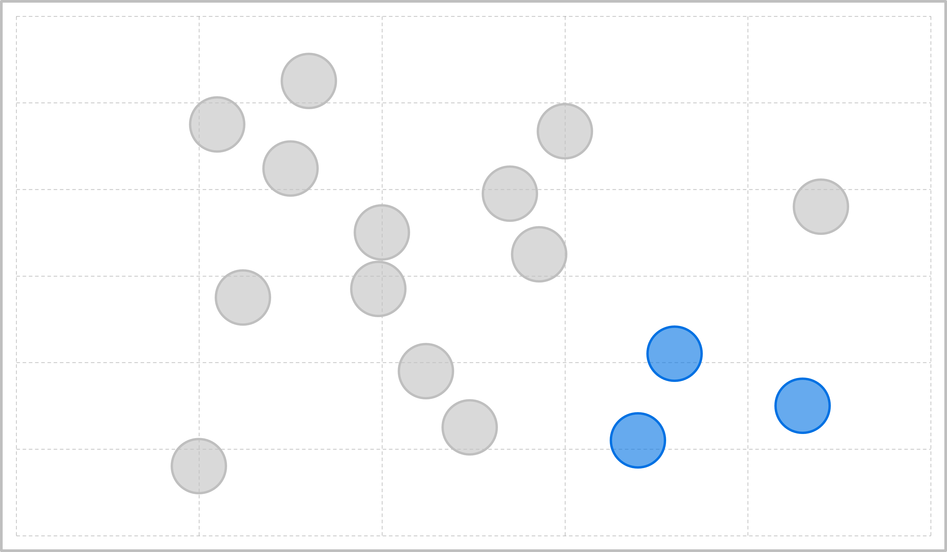
✔ Instant focus
✔ Emotional clarity
✔ Visual storytelling that actually works
Color is not for decoration. It’s for direction.
Common Color Mistakes in Data Stories
1. Too Many Colors
When everything is colorful, nothing stands out.
2. Misleading Colors
Using green for bad performance or red for something positive creates confusion.
3. Inconsistent Use
When the same category is blue in one slide and orange in the next, you break trust.
4. Color Overload for Aesthetic’s Sake
Just because it looks pretty doesn’t mean it’s clear. Design should serve clarity, not creativity.
The Fix: Use Color Intentionally
Use color to guide, not to decorate.
Here’s how:
1. Limit your palette to 2–3 key colors
2. Assign consistent meaning to each color
3. Use neutral tones as your base and bold colors for emphasis
4. Think about how you want your audience to feel and choose accordingly
Why This Works
✔ Clarifies your message
Color becomes a tool for storytelling, not confusion.
✔ Builds emotional alignment
The feeling matches the facts—so your audience stays engaged and responds appropriately.
✔ Makes your data unforgettable
People remember stories they feel. Color makes that happen.
Take Action:
Before your next chart, dashboard, or slide, ask:
-
What do I want my audience to feel?
-
Am I using color to guide attention or just to decorate?
-
Have I made it easy to know what matters most?
Make color your secret storytelling weapon not your silent saboteur.
Make Color Count
Poor color choices confuse. Smart color choices create clarity. At Data Story Academy, we teach professionals how to design visuals that are easy to read and hard to forget using our PICASSO methodology. Learn how to apply color so your message sticks.
Want to Master Data Storytelling?
If you’re ready to transform your dashboards, slides and reports into compelling narratives, check out Data Story Academy, where thousands of professionals are learning how to communicate insights with clarity and impact.