Four Steps for Building an Epic Sales Dashboard Using Data Storytelling
Mar 08, 2022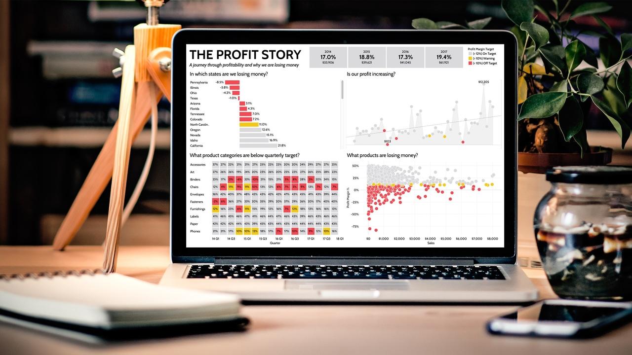
There is no better indicator of a company’s health than looking at your sales data. Sure - there are other measures you should take into account: the amount of liquidity on hand, operational efficiency, and your ability to meet debt obligations, however, underpinning all of these measures is revenue.
A sales dashboard offers a visual representation of your company’s revenue generated through sales. It’s an important point of reference for understanding how your sales team is performing, identifying trends and spotting opportunities or areas for improvement.
No matter how big your company is, or the industry it falls within, a powerful sales dashboard is an important tool to guide decision making at the executive level and beyond. But designing a good sales dashboard is not that easy. The sheer amount of data available to business analysts today can make it difficult to find the data that matters most and determine how best to display it.
At Data Story Academy, we believe a good sales dashboard should be three things: easy to understand, audience-centric, and insight-rich without overwhelming your audience.
Easy to understand
Probably one of the most important aspects of any dashboard is its ability to inspire quick insight. Just like the dashboard in your car, your sales dashboard should show only critical, pertinent information, and enable the user to understand that information at a glance. It needs to be clear, simple and striking.
Audience-centric
The value of any dashboard is its ability to synthesize mountains of data and display it in a way that creates meaning. That means, as the creator of the sales dashboard, it’s your job to take your sales data, extract what matters based on your audience’s needs, and determine the best way to present it.
Insight-rich without overwhelming
At their worst, a bad sales dashboard displays an overwhelming amount of data with no clear message, takeaways or insights. On the other hand, a good sales dashboard strikes the right balance between information and insight, and empowers your audience to discover patterns, spot trends and enables them to make business decisions, quickly.
This is where data storytelling comes into play. Data storytelling is a powerful strategy for communicating information in a business setting because it empowers quick learning, fosters alignment and drives data-driven action.
Data storytelling provides a structured blueprint for designing and organizing your sales dashboard, based on the typical narrative structure--something many of us learned back in grade school.
When you first begin building your sales dashboard, you likely already have an idea of your audience and your narrator (you). But building a compelling data-driven story requires you to dive in a bit deeper. Here are our steps to get started:
Four Steps for Building an Epic Sales Dashboard
Step 1 - Research Your Audience
When sitting down to plan out your sales dashboard, start by seeking to understand your audience. Go beyond names and job titles and ask the following questions:
- Who are you designing the sales dashboard for?
- What are their priorities? How do they measure success?
- How do they intend to use this sales dashboard?
- How familiar are they with your sales data?
- How will they engage with your dashboard? Will it be something they reference many times over, or will they look at it for a few minutes in the course of a larger meeting?
- What is their level of data literacy, in general?
Based on your research into your audience and their objectives, you can further define the other parts of your data story: the setting, the problem or challenge at hand, the resolution and the conclusion. Furthermore, understanding how they intend to engage with the dashboard, as well as their level of data literacy and other aspects, will help you determine the level of detail in your analysis.
Step 2 - Identify Points of Tension
Based on your audience research, you can identify the questions your sales dashboard needs to answer. These points of tension align with the climax of your story, form the basis of your data visualizations and help you determine what specific data visualizations you need to include within your sales dashboard.
Step 3 - Decide Your Key Messages
At the heart of every dashboard is a central idea, theme or message that you want to communicate. This is determined by the needs of your audience and reflected across your story’s title, the data points you select, the way in which you visualize that data, and the order in which you display it.
Step 4 - Determine What’s Next
The resolution and conclusion are probably the most commonly overlooked parts of a data storytelling-driven sales dashboard. The resolution outlines the actions that can be taken with the insights you’ve revealed, and what the expected results are based on those actions.
A solid, story-driven sales dashboard can help your company’s executives track progress, plan for growth, adjust compensation, and even inform how they award bonuses, depending on the dashboard’s objective.
Remember: at the end of the day, data is just a bunch of numbers without a clear story to back it up. It’s up to you to effectively communicate its meaning, and make sure you get the point across.
Data storytelling is a powerful communication strategy that can be applied to analyzing any part of your business, not just your sales organization. If you’d like to learn more data storytelling strategies for creating reports, dashboards, and other business presentations, explore Data Story Academy’s online data storytelling courses.
Learn to Navigate The Fundamental Challenges of Dashboard Design with Data Story Academy