
Learn To Navigate the Fundamental Challenges of Dashboard Design
Access tips, tricks and tutorials for designing more impactful dashboards
As someone who works closely with your company’s data, you’re in the best position to lead the conversation about it. A well-designed dashboard provides a powerful way of initiating these conversations.
However, as many analysts have found, the task of designing a dashboard is accompanied by some very specific and fundamental challenges that are not easily solved by a quick Google search. Luckily, we’re here to help.
Fundamental Challenge #1: How to Approach Dashboard Design
At a basic level, dashboard design requires a combination of logical (left-brain) thinking, as well as a creative, narrative-driven approach typically assigned to right brain-dominant thinkers.
This presents a challenge for analytics professionals who are typically more left-brained. Many simply resort to cramming as much information into a single dashboard as possible. It is only after having a few dashboards flop that many begin to seek out a better way.
The answer? Data Storytelling.
At the heart of every good dashboard is a central story or message that is reflected across the dashboard’s content, flow, and design. Data storytelling provides a structured approach for communicating this message with data.
As Brené Brown, world renowned researcher and author said, “Maybe stories are just data with a soul.” Data storytelling is an effective strategy for dashboard design because it enables you to express information to executives in a way that is easily understood and inspires action.
BECOME A DATA STORYTELLING EXPERT
The 20 Data Storytelling Keys for Success is your guide to understanding and developing data storytelling skills of your own. These keys are often what separates a clear message or data story from a confusing one.
Fundamental Challenge #2: How to Ensure Your Message Is Received
Just as characters are critical to stories, the first step of designing a dashboard is establishing your audience: specifically, who you’re creating this dashboard for and what they care about.
As you sit down to design your dashboard, here are some questions to guide your understanding of your audience:
1) For whom are you designing this dashboard? Be specific here. Consider an individual’s department, their role, their focus, what they care about and how they measure success.
2) How do they intend to use the data? What questions is your audience looking to have answered by your dashboard? Questions form the basis of dashboards, and your data visualizations should offer clear answers to those questions.
3) How will they be interacting with the data? Will the information be presented in a meeting? Will your audience look at it for 10 minutes and then move on to another topic, or will they want to go more in-depth?
Your answer to this question will dictate the complexity of your dashboard and help you determine whether you should use interactive elements and links to provide additional context, or keep your dashboard visualizations at a higher-level and use summary text to outline key insights.
4) How does your audience typically consume data? Gauging the technical and analytical ability of your audience ensures that your dashboard delivers insights in a way that will immediately resonate and inspire quick decision-making.
Personalizing your dashboard based on your audiences’ needs ensures the content is meaningful and valuable. However, keep in mind that different audiences may have different questions and may require different data visualizations. You may need to design different variations of the same dashboard to meet the needs of your distinct audiences.
Finally, you may not always be in the room when your dashboard is being accessed. Because of this, it’s critical that you craft your data story and design your dashboard in a way that allows it to stand on its own.
PREVIEW THE COURSES
THE BLUEPRINT - Learn a 5 step process to find the most important stories in your data and validate these are the stories your audience wants to hear.
THE CANVAS - Learn 7 design principles that will allow you to lean into your creativity and design effective data stories that resonate with your audience.
THE STORY - Learn 7 data storytelling techniques to increase your confidence in public speaking, draw your audience in and leave them wanting more.
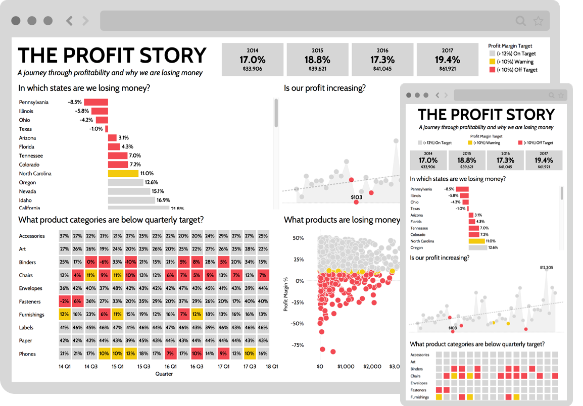
Fundamental Challenge #3: Choosing the Best Data Visualizations
Because the human brain processes images about 60,000-times faster than text, data visualizations are critical to helping your audience spot patterns, trends and outliers within your data story, and use these insights to guide their decision making. However, selecting the right data visualization is probably the most difficult challenge of dashboard design.
When choosing a data visualization, think back to your audience and the questions they’re looking to answer with your dashboard.
Your dashboard data visualizations should:
1) Inspire quick insight: Your charts and graphs should enable your audience to find the insight(s) within your data as quickly as possible.
2) Provide context: Your data visualizations should provide enough context to help your audience understand their significance.
3) Avoid chaos and clutter: Your visualizations should strike a balance between complexity and clarity, and be free of any structural elements that distract the viewer and clutter your dashboard.
4) Use color thoughtfully and intentionally: There’s nothing worse than looking at a dashboard and immediately feeling overwhelmed by it. Many times, this is due to the number of colors you’re using and how often you’re using them.
When designing your dashboard, we suggest keeping your color palette to 3-5 colors. When selecting these colors, be mindful of any color psychology principles or cultural contexts that may be at play.
Use colors to highlight specific information and insights, while making sure to apply them consistently. Finally, layer colors against white and/or muted neutrals (such as gray) to make your visualizations pop.
What are people saying?

Deb Hawkins | Senior Analyst, ECommerce Data & Analytics
"Hi Zack, I just watched your courses and have to say they were fantastic . . . because how often do you actually find courses worth watching?! It's very rare. The title of the email I sent to my boss and co-workers was “It’s like finding a unicorn!” Thank you for the valuable insights!"

Christina Stathopoulos | Data Expert at Google, Professor - IE Business School
"The Data Story Academy courses are wonderful material for any professional wanting to gain core skills when it comes to communicating with data. A key for businesses today is making sense of all the data at hand, and proper data visualization is one of the best ways to do just that. These courses help you learn how best to present your data, showing a huge amount of information in minimal space and making sure to get your point across. Highly recommended!"

Langley Payton | Master's in Engineering, High School Geometry Teacher
"Data Story Academy has been paramount in giving me the tools I need to develop visualization and presentation techniques. Zack is a great coach who offers valuable insights into these skills. I am eager to take these insights from his own experience and use them to develop professionally into my own data visualization career."

About the Author
Zack Mazzoncini is the Founder of Data Story Academy and a Co-Founder of Seattle-based data and analytics firm Decisive Data. Over the years Zack has helped hundreds of organizations and individuals develop data-driven cultures centered around data storytelling. Zack graduated from the University of Washington with a degree in communications, rhetoric, and public speaking. He is considered one of the most entertaining and informative speakers in the analytics industry. Zack has helped numerous organizations—including Nike, Amazon, Starbucks, Google, TD Ameritrade, and Kaiser Permanente.
If your visualizations are confusing,
no one will pay attention.
Buy Data Story Academy to begin your journey toward becoming a better data storyteller.
Get Access COURSES PREVIEW
© 2021 Data Story Academy ™ LLC