Don’t Present What You’re Sending
Read Time – 5 minutes
You’ve likely seen it or done it yourself:
A presenter clicks to the next slide and it’s packed with charts, metrics, and long paragraphs. The audience immediately stops listening and starts reading. By the time the speaker finishes their point, half the room is still stuck trying to decode slide one.
Here’s the problem:
Most business professionals don’t design for the delivery method.
They treat every slide the same—whether they’re sending the deck or speaking to it.
And that’s a huge mistake.
Let’s break it down.
Speaking vs. Sending Slides: What’s the Difference?
Sending slides are designed to stand on their own.
They must be self-explanatory, data-rich, and capable of conveying your full message without a voiceover.
Speaking slides are visual aids.
They’re designed to support your message not compete with it. They should highlight just enough to keep the audience focused on you and your story.
If you use a sending slide while presenting, you risk losing attention.
If you use a speaking slide in an email, you risk losing clarity.
So let’s look at what it means to design for each.
Real Example: Marketing Dashboard
Sending Slide
You have four charts, a summary title, and key metrics for total reach, awareness, conversion rate, and satisfaction. The slide packs everything i so it can be sent, reviewed later, and still make sense.
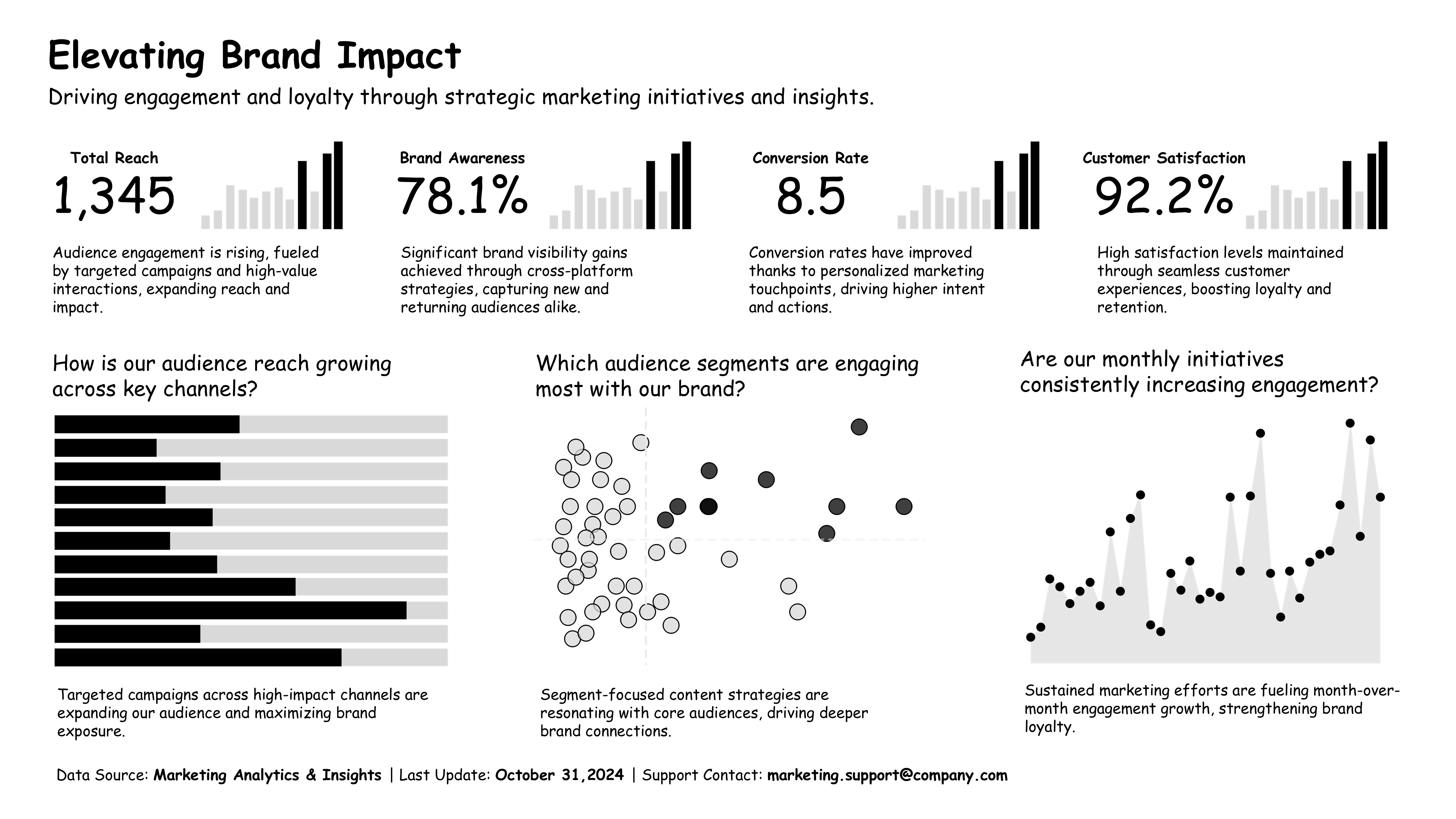
✔ Great for email
✘ Terrible for speaking
Why?
- It overwhelms the audience when presented live.
- There’s no clear focal point.
- People try to read while you’re trying to speak.
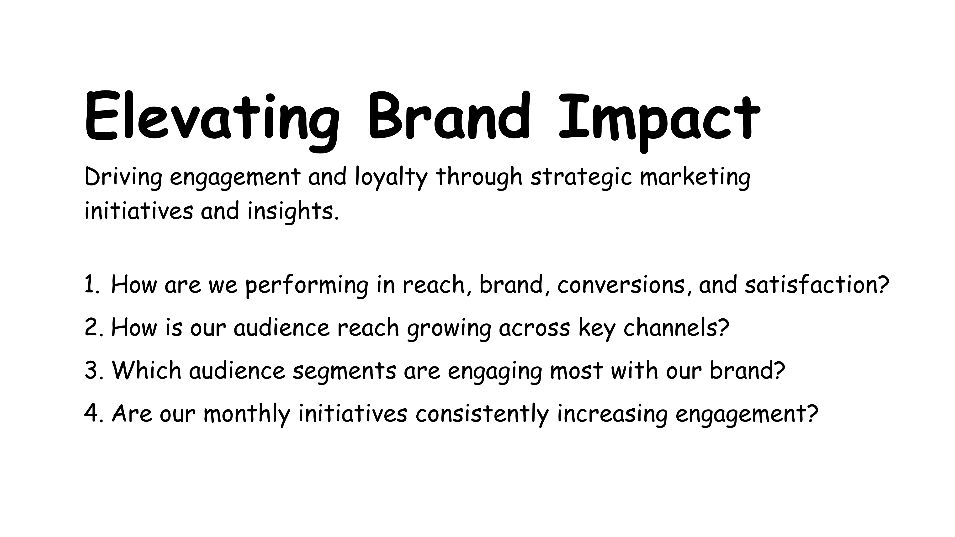
Speaking Slides
Now we split that same information into four focused slides:
Start with an opening slide that frames what you will cover in the presentation.
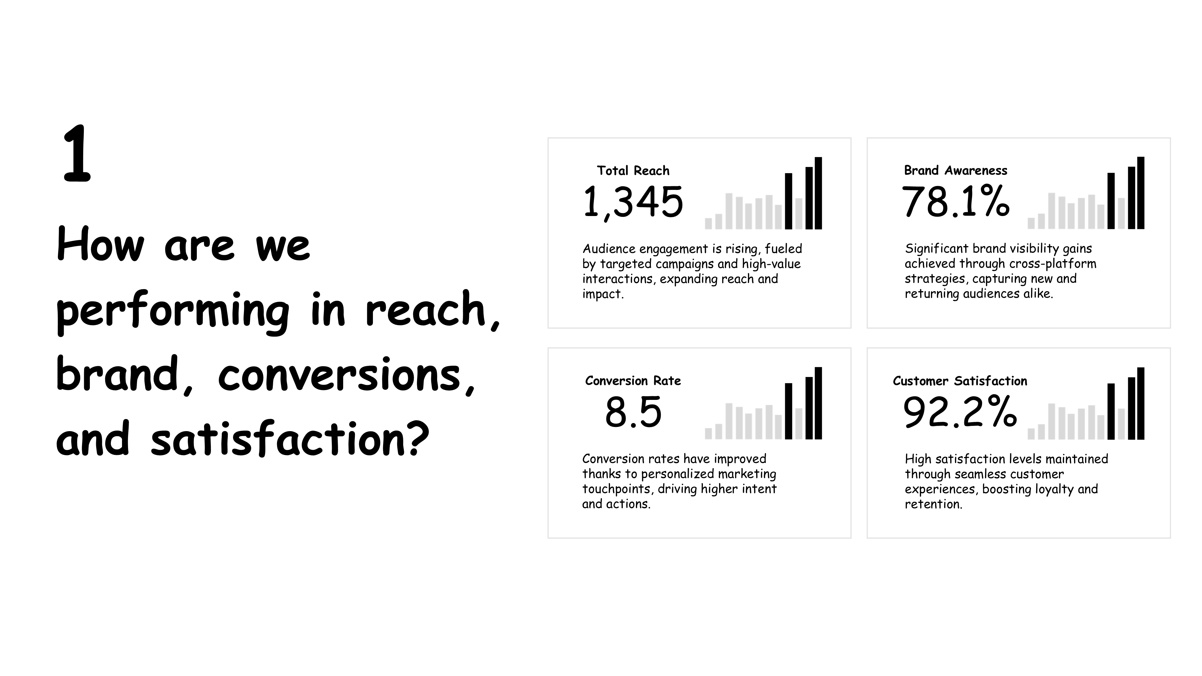
Speak to question one. How are we performing in reach, brand, conversions, and satisfaction? - Shows key KPIs only.
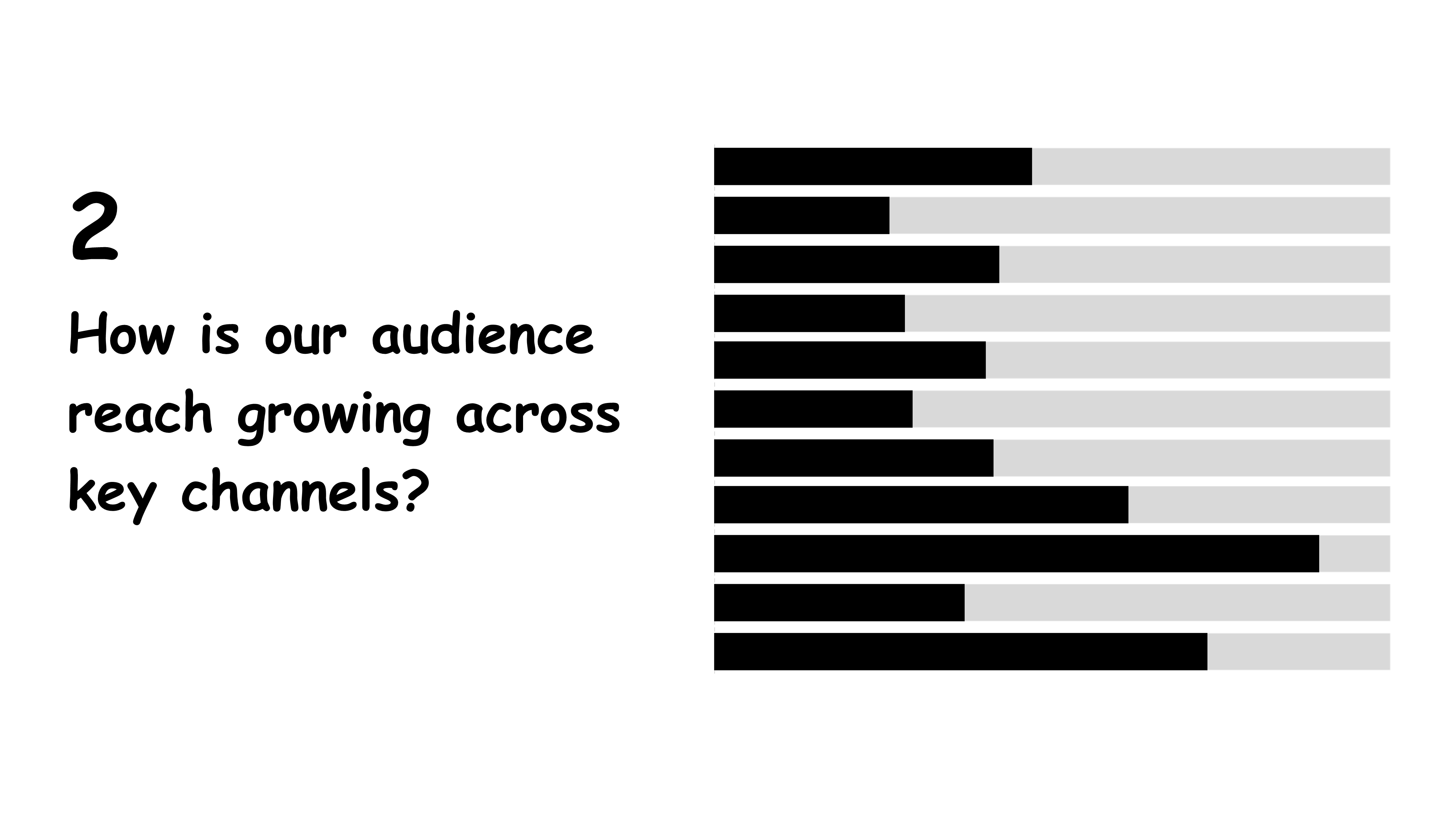
Speak to question two. How is our audience reach growing across key channels? - A single, focused bar chart.
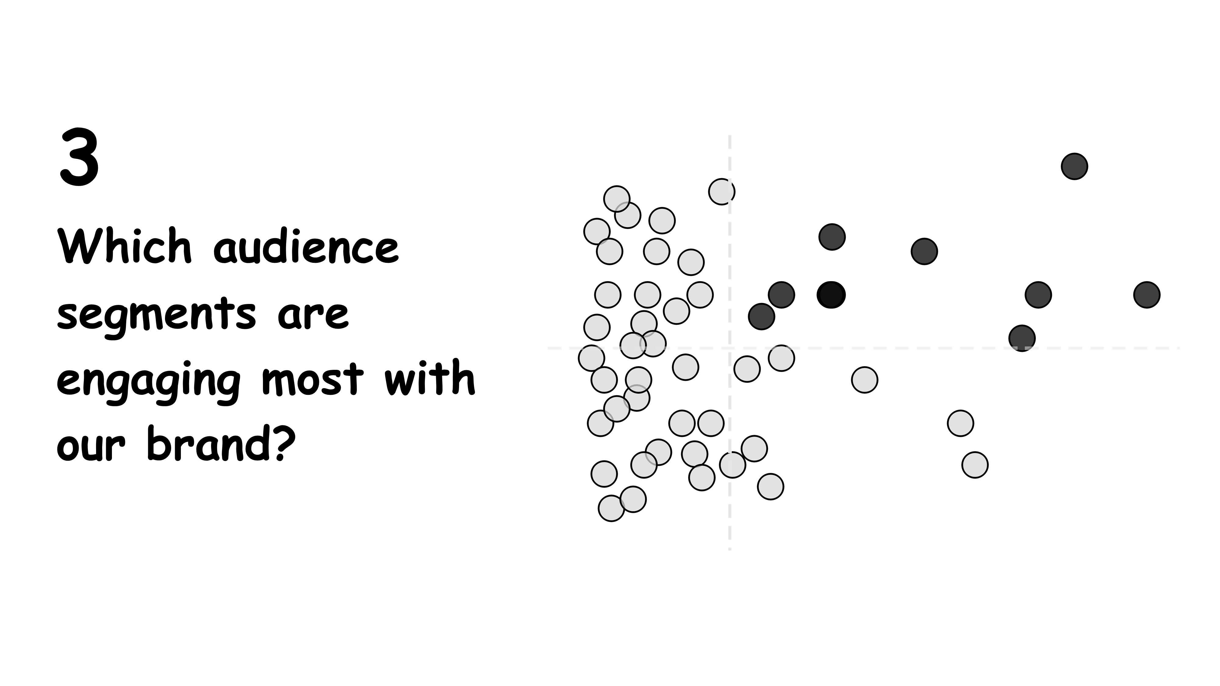
Speak to question three. Which audience segments are engaging most with our brand? - A simplified scatterplot for easy scanning.
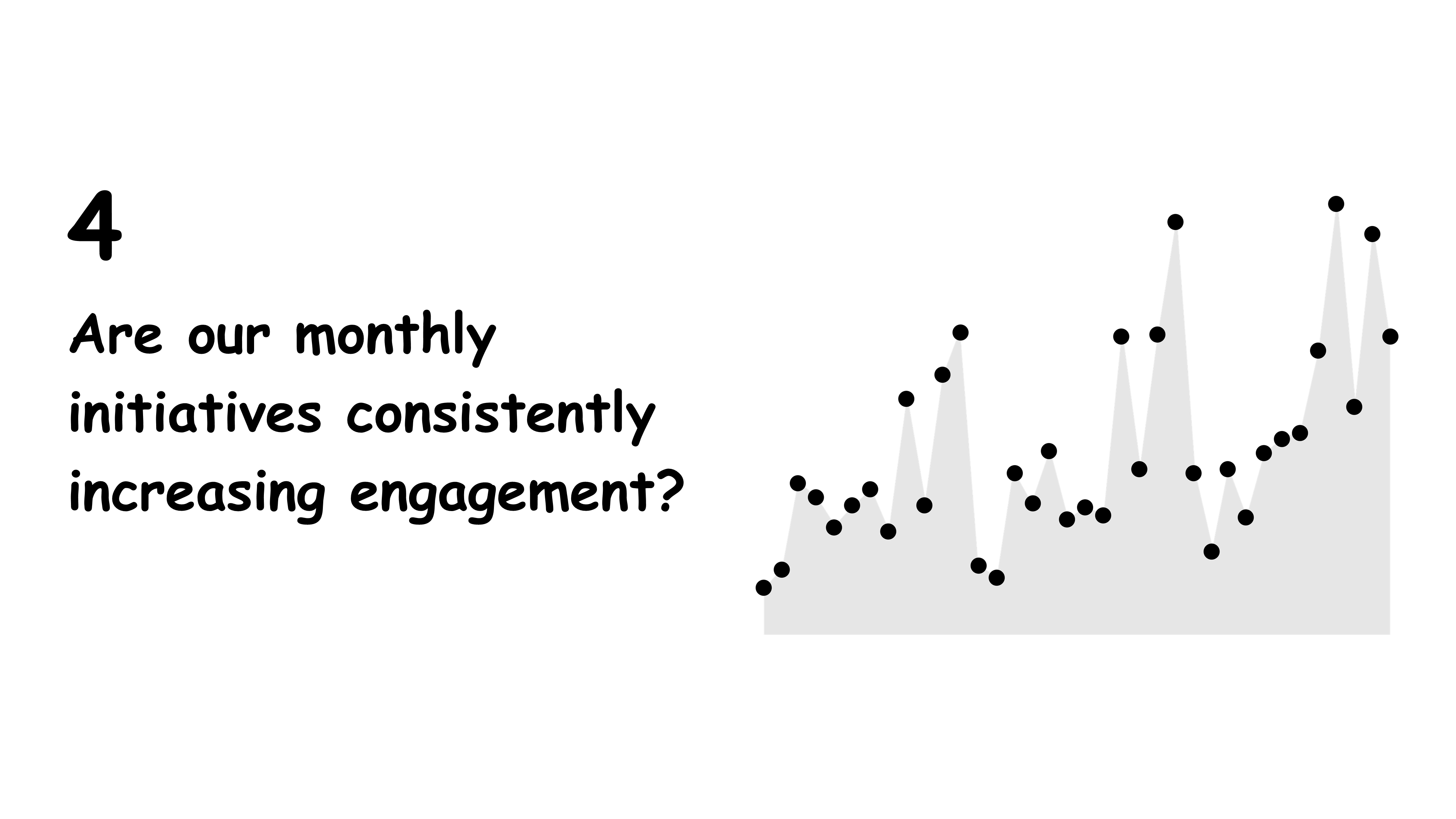
Speak to question four. Are our monthly initiatives consistently increasing engagement? - One clean trend chart.
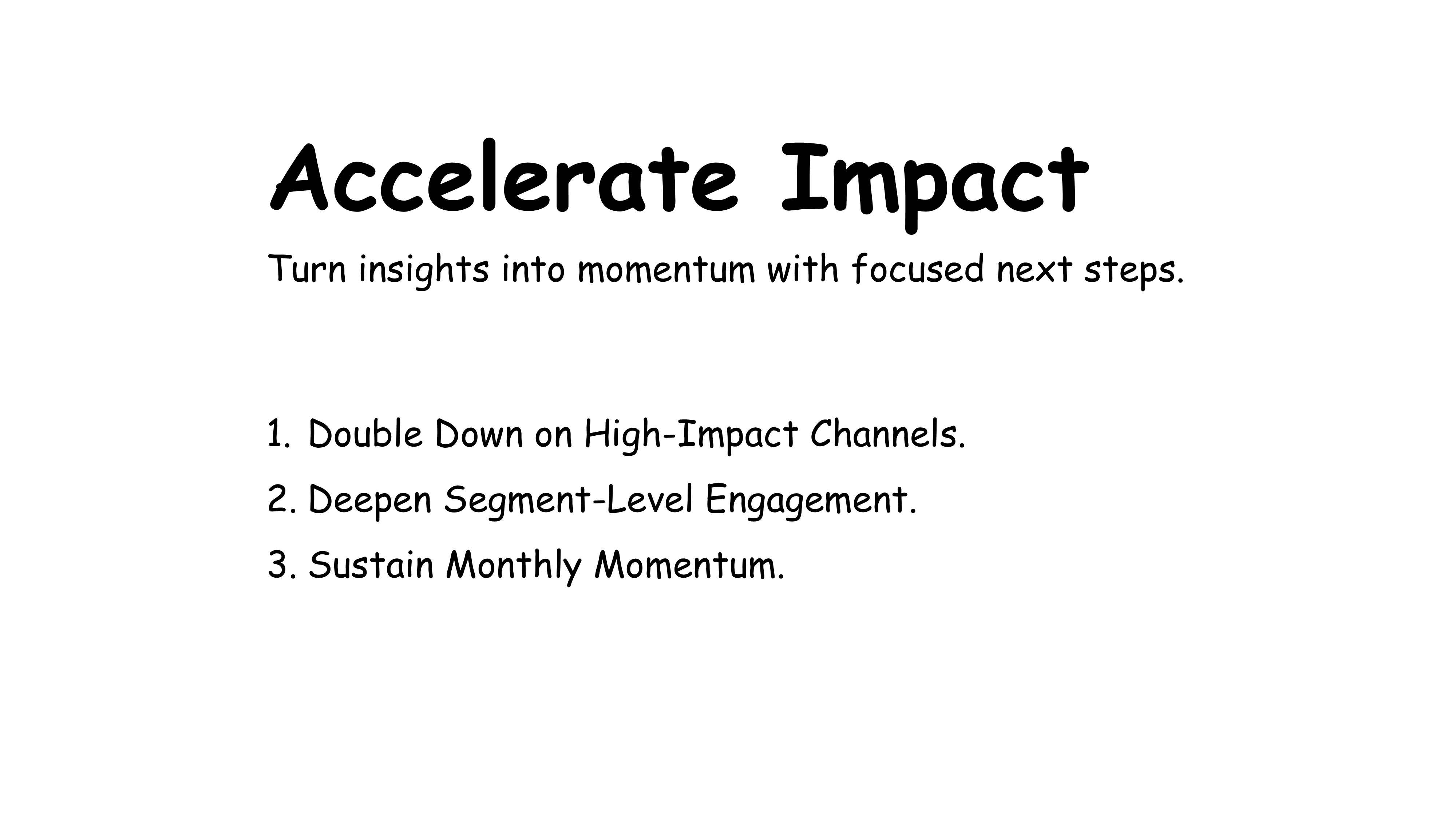
End with an closing slide that frames what actions and next steps will be taken.
Each speaking slide is clean, focused, and audience-ready. They don’t tell the whole story they let you do that.
Why This Works
Keeps attention on you
Speaking slides amplify your narrative. They don’t compete for attention, they guide it.
Improves clarity
Speaking slides reduce cognitive overload. Sending slides allow readers to absorb everything on their own.
Shows intentionality
You’re not just dumping data. You’re communicating it with purpose based on context.
Common Mistake: Designing One Slide for Both
Trying to design a slide that works for both scenarios almost always backfires. It ends up cluttered, confusing, and ineffective in both settings.
Here’s the fix:
The Rule:
One deck doesn’t fit all.
Create two versions:
-
A Sending Version: Self-contained with full context
-
A Speaking Version: Streamlined to support your message
And here's a tip, start with the Sending slide then simplify it (remove uneccesary information) for the Speaking slide.
Yes, it’s a bit more work.
But it’s also how you ensure your message lands.
Take Action:
Before you share or present a slide, ask:
-
Is this deck for sending or speaking?
-
Will my audience be reading or listening?
-
Does this slide support my message or steal from it?
Final Thought
Great communicators don’t just build great slides.
They design them with the delivery in mind.
See you next Tuesday!