
Presentation Skills Training
Learn strategies and skills for presenting data more effectively
How many times have you been in the midst of presenting data in a meeting, only to notice that your audience is completely disengaged? Perhaps they’re playing with their phone, or are distracted by whatever’s on their laptop screen. Or maybe their eyes have completely glazed over and they’re staring off into space.
This is actually quite frustrating for all parties involved. As businesses look to data to inform their decisions, a boring or confusing data presentation can actually lead to mixed messages, taking the wrong type of action, or taking no action at all.
And while you’re right to feel annoyed by a disengaged audience, it’s really on you to recapture their attention. After all, if you’ve spent time collecting data, analyzing it and trying to extract the insights for your audience, you should also make sure you’re communicating these insights effectively.
Master data storytelling in our three-part online course
While most presentation skills training programs focus solely on public speaking, many professionals actually struggle more with content. Specifically, how to structure and present data in a way that is understandable and actionable.
Data storytelling offers a structured approach for presenting information effectively by using narrative techniques to power your data presentations. This makes it a critical skill for anyone looking to deliver more effective and engaging presentations.
Data Story Academy’s three-part course was built for professionals who are looking to increase their skills and power their presentations with data storytelling.
The course spans three, in-depth modules: The Blueprint, The Canvas and The Story. Each of these build on each other to equip you with skills for crafting and delivering a powerful data story. Get instant access now.
What's included in the courses?
When you purchase the Data Story Academy online courses, you get instant access to all of the following tools. Begin your journey today toward becoming a better data storyteller.

3 Foundational Courses

22 Video Lessons

60 Page Workbook

50 Keys For Success

1 Visualization Guide

3 Course Worksheets

40 Question Assessment

Certificate Of Completion
Three Data Storytelling Strategies Delivering More Effective Presentations
Strategy #1: Know Your Audience
When it comes to designing a presentation with a lot of information , it helps to think of your audience as the ultimate user of your data. In order to connect with them, you have to place them at the center of your data story.
This is an effective strategy for many reasons. It ensures that your narrative is shaped by your audience’s perspectives, needs and how they view and measure success. When presenting, it also ensures that your audience is engaged with your presentation and feels invested in the solution.
Through Data Story Academy, you’ll learn strategies for defining your audience, determining what they care about and building your presentation around their needs. This ensures you can capture and keep their attention, and that they receive your message clearly.
Strategy #2: Use Data Visualizations to Answer Questions
At the heart of every data story is a central message, theme or big idea. Once you’ve determined your main idea, you can then figure out what additional questions you need to answer to complete your story. These questions should form the basis of any data visualizations you use in your presentation.
Through Data Story Academy, you’ll learn frameworks for determining these questions, how to identify the information that matters most to your audience, and how to select which data points are (or aren’t!) necessary to deliver the message. You’ll also learn best practices for designing effective and professional-looking data visualizations that enable your audience to quickly zero in on key insights.
Strategy #3: Make sure it flows intuitively - from insight to action.
Just like any story, your presentation should follow the typical story arc: it should have a beginning, middle and end, and it should flow intuitively between these stages. This comes down to the order in which you deliver information, as well as the way in which you display information.
Through Data Story Academy, you’ll learn strategies for ensuring your presentations flow logically, captures your audiences’ attention, inspires conversation and fosters alignment around next steps.
LEARN HOW TO PRESENT THE MOST IMPORTANT STORIES IN YOUR DATA
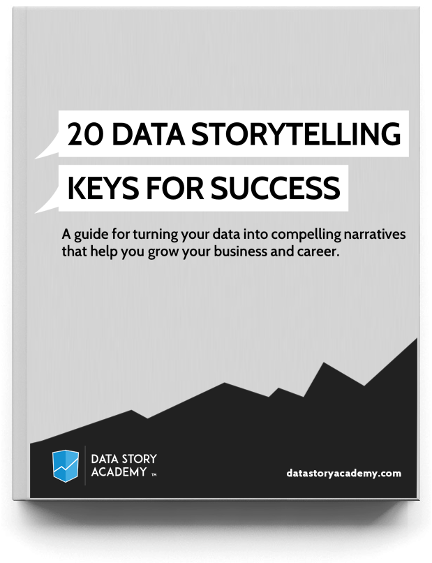
The 20 Data Storytelling Keys for Success is your guide to understanding and developing data storytelling skills of your own. These keys are often what separates a clear message or data story from a confusing one.
What are people saying about the courses?

Deb Hawkins | Senior Analyst, ECommerce Data & Analytics
"Hi Zack, I just watched your courses and have to say they were fantastic . . . because how often do you actually find courses worth watching?! It's very rare. The title of the email I sent to my boss and co-workers was “It’s like finding a unicorn!” Thank you for the valuable insights!"

Christina Stathopoulos | Data Expert at Google, Professor - IE Business School
"The Data Story Academy courses are wonderful material for any professional wanting to gain core skills when it comes to communicating with data. A key for businesses today is making sense of all the data at hand, and proper data visualization is one of the best ways to do just that. These courses help you learn how best to present your data, showing a huge amount of information in minimal space and making sure to get your point across. Highly recommended!"

Langley Payton | Master's in Engineering, High School Geometry Teacher
"Data Story Academy has been paramount in giving me the tools I need to develop visualization and presentation techniques. Zack is a great coach who offers valuable insights into these skills. I am eager to take these insights from his own experience and use them to develop professionally into my own data visualization career."

About the Author
Zack Mazzoncini is the Founder of Data Story Academy and a Co-Founder of Seattle-based data and analytics firm Decisive Data. Over the years Zack has helped hundreds of organizations and individuals develop data-driven cultures centered around data storytelling. Zack graduated from the University of Washington with a degree in communications, rhetoric, and public speaking. He is considered one of the most entertaining and informative speakers in the analytics industry. Zack has helped numerous organizations—including Nike, Amazon, Starbucks, Google, TD Ameritrade, and Kaiser Permanente.
Bring data to life in your presentations
Purchase Data Story Academy’s data storytelling training to begin your journey toward more effective presentations.
Buy The Courses COURSES PREVIEW
© 2021 Data Story Academy ™ LLC